flex를 쓰고있지만 매번 쓰던것만 써서 안쓰는 아이들을 배워보았다.
먼저 여러줄을 표현할때 매번 flex-direction 만 썻지만 flex-wrap으로도 할수있다하여 공부해보았다.
flex-wrap
<!DOCTYPE html>
<html lang="en">
<head>
    <meta charset="UTF-8">
    <meta name="viewport" content="width=device-width, initial-scale=1.0">
    <title>flex아이템을 여러줄로 배치하기</title>
    <style>
        #wrap{
            display: flex;

            /* 여러줄로배치 <-> 기본값 nowrap */
            /* flex-wrap: wrap; */

			/* 여러줄로배치 <-> 기본값 row */
            flex-direction: column;

            width: 90%;
            height: 500px;
            margin:0 auto;
            border:1px solid lightslategray
        }
        #wrap div{width: 100%;}
        #wrap div:first-child{background:lightcoral}
        #wrap div:nth-child(2){background:lightcyan}
        #wrap div:nth-child(3){background:lightsalmon}
    </style>
</head>
<body>
    <div id="wrap" class="">
        <div>1</div>
        <div>1</div>
        <div>1</div>
    </div>
</body>
</html>
둘다 여러줄을 표현해주는데 개념은 완전히 다르다할수있다.
우선 flex-wrap:wrap을 사용할때는 #wrap div에 height값이 필요하지않다.
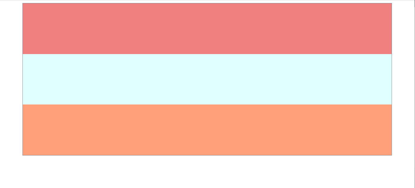
height값을 임의로 설정할경우 아래와같은 결과가나온다.


flex-direction과의 차이
그다음 flex-direction:column는 주축을 세로로 완전히 바꾸는개념이라 #wrap div에 height값이 필요하다
여기서는 숫자 1이 공간을 형성해줘서 보이기는하지만 숫자를지울경우 이미지가사라진다
꽉채우려면 height:100%로 바꿔야한다.
#wrap div{width: 100%; height:100%}


그밖에 inline-flex라는 아이도있는데 프로젝트때 유용하게쓸것같다.
flex-flow
flex-direction과 flex-wrap을 함께 표현할수있는데 예를들어
flex-flow : row wrap-reverse이렇게 둘만 나란히띄우면된다.
inline-flex

align-self와 order
지정된애만 바꿔주는 align-self와 order이있다

      #wrap{
            display: flex;
            width: 90%;
            height: 500px;
            margin:0 auto;
            border:1px solid lightslategray;
            /* 교차축을 중앙으로 */
            align-items: center;
        }
        #wrap div{width: 30%; height: 100px;}
        #wrap div:first-child{background:lightcoral; order:3}
        #wrap div:nth-child(2){background:lightcyan; order:2 }
        #wrap div:nth-child(3){background:lightsalmon; align-self: flex-end;}
반응형
'Frontend > Markup' 카테고리의 다른 글
| checkbox 커스텀, select All (0) | 2020.10.29 |
|---|---|
| 아코디언 메뉴 accordion menu (0) | 2020.10.29 |
| [css] div를 상하좌우 중앙정렬 (0) | 2020.08.13 |
| [css] ellipsis로 multiple lines '...'처리 (0) | 2020.07.28 |
| [css] height:100% vs height:auto (0) | 2020.07.25 |

