패스트캠프 프론트앤드 인강 29일차 scss에서 styled-components를 활용해 버튼을 만들고 styled-components-polished스타일 유틸함수를 사용해보았다.
[예제] styled-components로 재사용성 높은 버튼을 만들어보자.Button.js
import React from "react";
import styled from "styled-components";

const StyledButton = styled.button`
  /*공통스타일*/
  display: inline-flex;
  outline: none;
  border: none;
  border-radius: 4px;
  color: #fff;
  font-weight: bold;
  cursor: pointer;
  padding-left: 1rem;
  padding-right: 1rem;

  /* 크기 */
  height: 2.25rem;
  font-size: 1rem;

  /* 색상 */
  background: #228be6;
  &:hover {
    background: #339af0;
  }
  &:active {
    background: #1c7ed6;
  }

  /* 기타 */
  & + & {
    margin-left: 1rem;
  }
`;

export default function Button({ children, ...rest }) {
  return <StyledButton {...rest}>{children}</StyledButton>;
}
App.js
import React from "react";
import styled from "styled-components";
import Button from "./Button";
const AppBlock = styled.div`
width: 512px;
margin: 0 auto;
margin-top: 4rem;
border: 1px solid black;
padding: 1rem;
`;
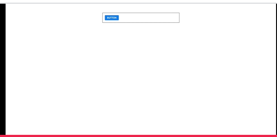
export default function App() {
return (
<AppBlock>
<Button>Button</Button>
</AppBlock>
);
}
이번에는 버튼에 다양한 색상을 줘보자.
polished라이브러리
여러가지 스타일 유틸함수가 들어는 라이브러리
✨ polished | Documentation
A lightweight toolset for writing styles in JavaScript.
polished.js.org

설치방법
yarn add polishednpm install --save polished활용예제
import React from "react";
import styled from "styled-components";
import { lighten, darken } from "polished";

const StyledButton = styled.button`
  /*공통스타일*/
  display: inline-flex;
  outline: none;
  border: none;
  border-radius: 4px;
  color: #fff;
  font-weight: bold;
  cursor: pointer;
  padding-left: 1rem;
  padding-right: 1rem;

  /* 크기 */
  height: 2.25rem;
  font-size: 1rem;

  /* 색상 */
  background: #228be6;
  &:hover {
    /* background: #339af0; */
    background: ${lighten(0.1, "#228be6")};
  }
  &:active {
    /* background: #1c7ed6; */
    background: ${darken(0.1, "#228be6")};
  }

  /* 기타 */
  & + & {
    margin-left: 1rem;
  }
`;

export default function Button({ children, ...rest }) {
  return <StyledButton {...rest}>{children}</StyledButton>;
}
컬러버튼만들기

ThemProvider을 사용하면
색상을 어떤스타일 컴포넌트든지 쉽게 조회해서 사용할수있다.
...
import styled, {ThemeProvider} from 'styled-components'

const palette ={
  blue:"#228be6",
  gray:"#496057",
  pink:"#f06595"
}
export default function App(){
return(
	<ThemeProvider theme={{palette}}>
    ...
    </ThemeProvider>
);

...
    ...
    /* 색상 */
    /* background: #228be6;  */
    background: ${props => props.theme.palette.blue};
        &:hover {
             /* background: ${lighten(0.1, "#228be6")};  */
             background: ${props => lighten(0.1, props.theme.palette.blue)};
        }
        &:active {
            /* background: ${darken(0.1, "#1c7ed6")};  */
            background: ${props => darken(0.1, props.theme.palette.blue)};
        }
    ...
위의 코드를 하나의 함수안에 묶어서도 표현할수있다.
import styled, {css} from 'styled-components';
...
${props =>{
        const color = props.theme.palette.blue;
        return css`
            background:${color};
            &:hover{
                background:${lighten(0.1, color)};
            }
            &:active{
                background:${darken(0.1, color)};
            }
        `
    }}
이제 다른색상도 진행해보자.
color를 프롭스로받아오고
default값을 blue로 설정한다.
    /* 색상 */
    ${props =>{
        const color = props.theme.palette[props.color];
        return css`
            background:${color};
            &:hover{
                background:${lighten(0.1, color)};
            }
            &:active{
                background:${darken(0.1, color)};
            }
        `
    }}
    ...

export default function StyledBtn({children, color, ...rest}){
    return(
        <StyledButton color={color} {...rest}>{children}</StyledButton>
    );
}

StyledButton.defaultProps = {
    color:'blue'
};
색상은 밖으로 빼낼수도있다. const ColorOutside = css`...`
프론트엔드 개발 올인원 패키지 with React Online. | 패스트캠퍼스
성인 교육 서비스 기업, 패스트캠퍼스는 개인과 조직의 실질적인 '업(業)'의 성장을 돕고자 모든 종류의 교육 콘텐츠 서비스를 제공하는 대한민국 No. 1 교육 서비스 회사입니다.
www.fastcampus.co.kr
반응형
'Frontend' 카테고리의 다른 글
| [패스트캠퍼스 수강 후기] 프론트엔드 인강 100% 환급 챌린지 31회차 미션 (0) | 2020.09.09 |
|---|---|
| [패스트캠퍼스 수강 후기] 프론트엔드 인강 100% 환급 챌린지 30회차 미션 (0) | 2020.09.08 |
| [패스트캠퍼스 수강 후기] 프론트엔드 인강 100% 환급 챌린지 28회차 미션 (0) | 2020.09.06 |
| [패스트캠퍼스 수강 후기] 프론트엔드 인강 100% 환급 챌린지 27회차 미션 (0) | 2020.09.05 |
| [패스트캠퍼스 수강 후기] 프론트엔드 인강 100% 환급 챌린지26회차 미션 (0) | 2020.09.04 |


